Using Color To Hide Our Non-Stop Consumer Culture
As a product of a growing 24/7 consumer culture, more and more superstructures like warehouses, depots, and distribution centers are found throughout our landscapes. These superstructures are not only a permanent reminder of our consumer behavior, but they are also an eyesore. Architects have found a (clever) way to deal with this.
There is an increasing number of superstructures that are necessary to support the mass consumption that dominates the world. It is inevitable that more and more warehouses, storage facilities, and distribution centers will pop up across the world, along highways and railroads. Not only do they change our landscape, these structures also confront us with the fact that our planet holds more and more ‘stuff’ that we all think we need. The way we are reminded about this is with loads of concrete, dull colors, and big view-obstructing walls.
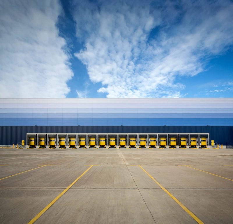
Recently, especially in the UK, many of these superstructures started to have less offensive exteriors. Their architects are increasingly trying to make them less visible by using colors that match the surrounding landscape. As most warehouses are large, yet relatively low, they are easy to blend into the landcape by layering panels with different shades of the same color across the width of the building. Buildings that are commonly viewed from a slope receive colors that match the color of the surrounding vegetation or earth. Buildings that are generally viewed from a low vantage point will be made blue or white to seamlessly blend into the sky.
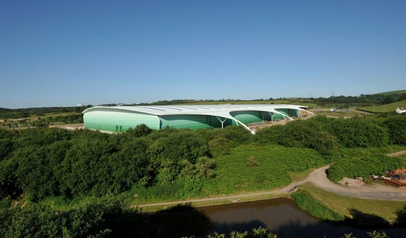
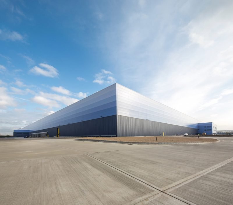
Whether it is best to conceal superstructures in this way or to have them visible to the public eye is a question for debate. Concealing our warehouses will hide our close relationship with consuming, perhaps making us more ignorant about the consequences of mass consumption. Having superstructures around as reminders of our behavior could be useful in generating more awareness around labor rights, pollution, and waste.


