Rebranding Norway’s Gateway to the Fjords
Bergen, Norway’s most scenic city, has been rebranded by creative agency ANTI to highlight its diverse culture and communities instead of merely focusing on the increase of tourism.
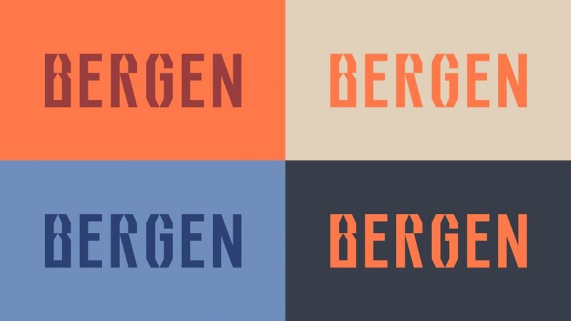
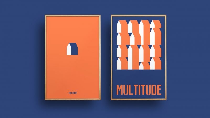
The new campaign will represent hundreds of board members forming together Visit Bergen and will be fully rolled out in 2020. The multipurpose visual identity doesn’t come with a classic logo, but a distinctive typeface that the various stakeholders can combine themselves by selecting from a diverse color palette.


Since millennial travelers around the globe are now planning their trips according to ‘instagrammability’, picturesque cities like Bergen are feeling a greater influx of tourists each year. Especially the masses of tourists arriving with cruise ships are troubling the once so advertised “gateway to the fjords”.


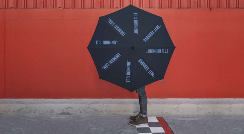
As part of the new campaign, ANTI produced a music video together with Bergen-based hip hop artists in which rap lyrics collide with footage from the 1950s. The old film material is a throwback to those times when Norway hadn’t yet found its rich oil resources, which led to the country’s economic rise and today’s wealth. Further, a range of merchandise was designed featuring guide booklets and practical umbrella for the ever-changing weather in the fjords.
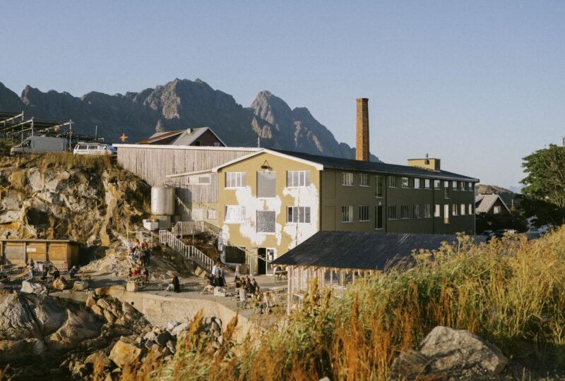
The municipality of Bergen has recently decided to set a daily limit to the number of cruise ships anchoring. This is not only a first try to gain control over so-called “people pollution”, but also the growing problem of bad air quality, partially caused by the emissions coming with those floating bed bunkers. To maintain livability for citizens, tourism marketing needs to be reconsidered urgently. By rebranding Bergen as a “city in full contrast”, studio ANTI has delivered a forward-thinking approach.