Spacecraft 2 #2
Last Friday I paid attention to Spacecraft 2 by showcasing some of the more than 150 projects covered in the book. Under the slogan ‘more fleeting architecture and hideouts’, authors Robert Klanten and Lukas Feireiss present a wide range of spatial projects that focus on a flexibilizaton of urban lifestyle. In my previous article I outlined the first three chapters of the book. Today I’ll focus on the second part (sections 4-6) by providing a few more inspiring projects.
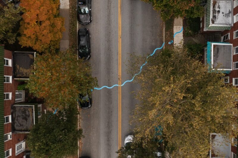
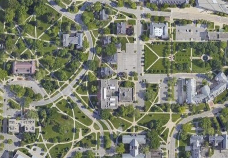
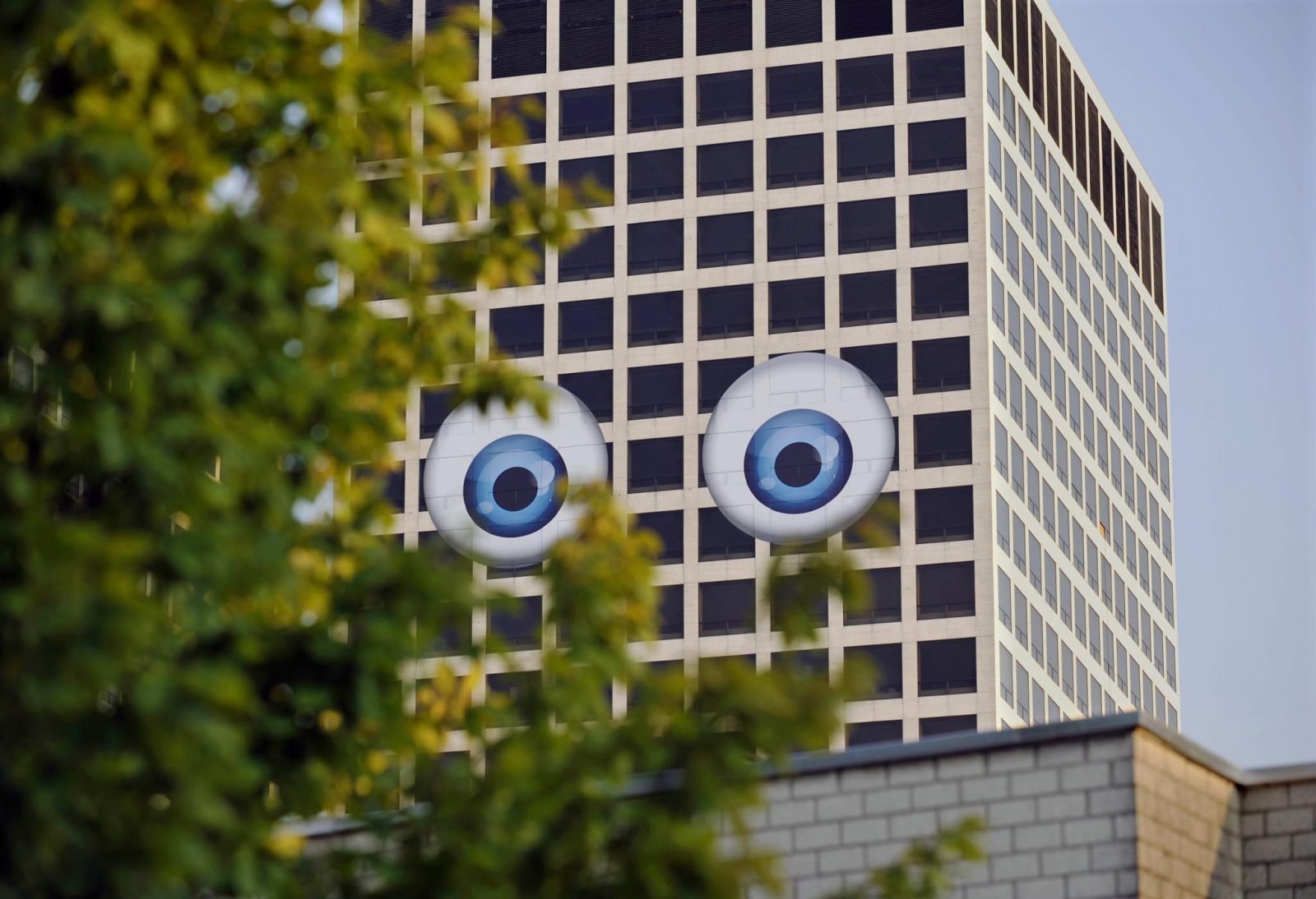
Entitled ‘Walk This Way’, the fourth chapter of Spacecraft 2 focuses on transit spaces, such as passages, stairs, bridges, and mobile units of very shape and size. “These architectural pathways seem to adapt fluidly to any given restraint within the built environment.” The selection of projects in this section emphasizes the concept of architecture as a process rather than an object. This comes to the front in many projects of the Office for Subversive Architecture (OSA), of which two are featured. OSA is a network of eight architects based in London, Vienna, Köln, Berlin and Frankfurt. Their work is a blend of art and architecture, exploring the way people use and interact with public spaces, especially in relation to urban regeneration. (Man, we love it.) The picture below shows their parking lot design in Cologne’s Anwohner Park. Actually it’s not a very new project (it’s almost four years old), but the concept and its execution are so brilliant that this project deserves to be mentioned. This work goes beyond architecture; it’s more considered to be an urban intervention. OSA managed to attach function to a large, anonymous wall that divides two districts in Cologne. The wall itself is part of KunstWerk, the largest studio complex in Germany.

The fifth section of the book is called ‘Just Lose It’ and presents projects that “illustrate both the possibilities opened up by a loss of control or the breakdown of form in ever-eclectic constructions, and the potential of recycling waste materials for building construction”. Here, the Spacecraft authors emphasize the creative potential of waste materials and give insight in architectural responses to over-consumption. The chapter showcases many projects of Rotterdam-based recycling architects of REFUNC. Jan Korbes and Denis Oudendijk only use waste materials to design physical structures. Oftentimes their approach is not just ‘green design’, but it also brings forward new space typologies in which function follows form. Think of their famous capsule hotel.
This creation of Anna Galtarossa and Daniel González immediately grabbed my attention. Under the name of ‘Homeless Rocket with Chandeliers’, they transformed a fully operational thirty-meter construction crane in Milan into a rocket-city with chandeliers. The concept of turning such a temporary structure into a piece of art is very appealing, as construction cranes generally have a big impact on skylines of urban transformation areas. The project fits very well with these times in which ‘Homo Ludens’ has regained attention. Construction workers kept on using the crane after its transformation.
In the the last chapter of Spacecraft 2, Klanten and Feireiss focus on ‘blow up’ by featuring spatial projects that “magnify the abandonment of customary approaches to built space”. Soft structures that apparently seem to breathe, float and move, and feel like a second skin when you’re inside. Structures that are able to change one’s perception of space by setting a completely extraordinary atmosphere. Inflatable architecture forms an important part of this chapter.
In regard to the creation of new types of atmospheres, Tokyo-based designer Tokujin Yoshioka did a very good job. His ‘Tornado’ project in Miami is a piece of work that completely overwhelms the visitor. For the occasion of Design Miami, Yoshioka created a large, mind-blowing space installation consisting of two million transparent straws. “As a cloud and snow, thousands and millions of the particles add up to a white structure. By simply using transparent straws, he created a natural phenomenon — a tornado inside the room.” Click here for a Designboom article on Yoshioka’s installation.
Okay, I think I’ve said enough about Spacecraft 2. Get your hands on this great, fat reference work and you’ll keep browsing through it. It’s a document that, on the one hand, shows spatial projects that are timeless in their beauty, and on the other hand, perfectly captures the current debate about new directions and new explorations in architecture by showcasing work that moves refreshingly beyond old notions.
Spacecraft 2 (2009)
Robert Klanten and Lukas Feireiss
Gestalten, Berlin
280 pages, full color, hard-cover


