Metrominuto: The Subway-Inspired Map For Pedestrians
Walkability is a subject many cities are increasingly getting involved with. Our legs are often overlooked when thinking about transport in the city, with municipalities passionately constructing bicycle lanes and roads as far as the eye can see whilst competely forgetting about the pedestrian’s needs. Instead of focusing on these forms of transport, Pontevedra in northwest Spain has been trying for the last 15 years to make their city more walker-friendly. To further improve walkability, they have created a subway-inspired map for pedestrians.
Walking can be great. You take in your surroundings far better and in more detail when walking compared to cycling or driving a car. Exploring an unknown city is a lot of fun to do cycling and rushing through the streets, but to really appreciate what the city has to offer it often is a better idea to just walk. Pontevedra agrees and designed a map resembling a subway guide, colours and all, that shows the rough locations of certain landmarks (or citymarks, if you will) and how long it will take (both in distance and time) to get there, using the Peregrina square as a central point.

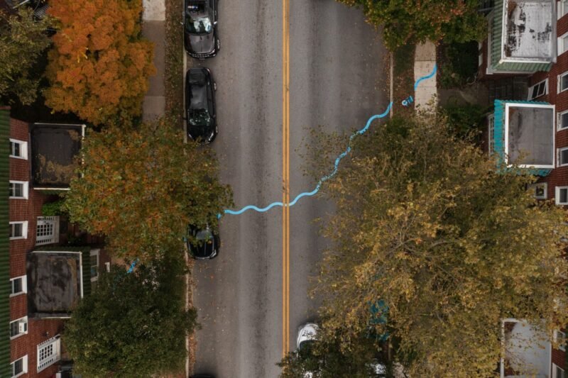
The map, called Metrominuto (which means ‘meters minutes’), is accompanied by banners hanging throughout the city showing distances and travel times that are on the map as well. It ensures that walking is not perceived as a chore, but as something healthy and fun. It also removes the threshold of now knowing the distance or time it will take to get to a specific place and therefore deciding not to go by foot.
We think that every large city in the world should have a map like Metrominuto. Knowing where to go and how long it will take you will make exploring the city by foot a lot more fun and relaxing. The subway guide form factor is also very recognizable to many people and easy to read. With this map, metrominuto has just paved another small part of the road towards walkability in the city.